Transforming & Automating the Fintech Dashboard Experience
Biz2Credit
Dashboards play a critical role in providing users with essential data and insights, enabling smooth interactions with application processes. However, Biz2Credit, a leading digital lender for small businesses, faced a significant challenge—its customer dashboard was neither functional nor intuitive. As a result, users struggled with status updates, task navigation, and document submission. So, I redesigned it.
Role Lead Product Designer
Responsibilities Product Design, Visual Design, Project Management, Content Writing, QA Testing
Problem Statement
Biz2Credit specializes in providing financing to small businesses, but the customer dashboard was a source of friction in the funding process. Specifically, the dashboard lacked clarity around application status, overwhelmed users with redundant calls-to-action (CTAs), and required manual intervention from customer support for document submission. The cluttered interface and lack of automation slowed down the funding process, creating a need for a comprehensive redesign to improve both navigation and speed.
Research
To better understand the user experience, we took a hands-on approach by completing funding applications ourselves. We then collected data on existing dashboard screens and identified the pain points specific to each funding product. We supplemented this research with customer interviews and user behavior analysis using Microsoft Clarity, heatmaps, and user session recordings. This data helped us pinpoint areas where users struggled and allowed us to focus on addressing key issues in the redesign.
UX Challenges
Application Status: The dashboard did not clearly convey whether the customer had tasks to complete or what steps they should take next.
Overloaded CTAs: The excessive and redundant CTAs confused users and hindered their progress through the application.
Hidden Tasks: Customers had difficulty finding the location for uploading required documents, creating unnecessary delays.
Complicated Navigation: Stacked accordions and excessive clicks were needed to open folders and organize files, leading to frustration.
Unnecessary Progress Bars: The dashboard included its own progress indicator, which conflicted with the application flow and created friction.
Misalignment with Internal Teams: The customer’s status did not align with internal teams, making it difficult to track progress and provide accurate updates.
Planning
Collaborating closely with my product manager, we mapped the customer journey and redefined the dashboard statuses to make them more intuitive. We rewrote the copy to provide clear, actionable instructions for the user. This process involved analyzing hundreds of dashboard screens to ensure that the new statuses worked across all financial products, making the redesign scalable and easier to maintain in the future.
The MVP (Minimum Viable Product)
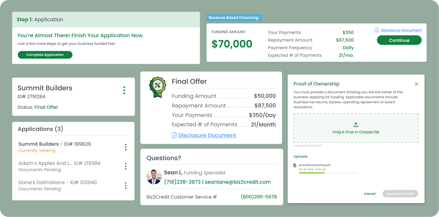
Given the scope of the full redesign, we first launched an MVP to test the most critical components. The MVP introduced a reusable document upload component, allowing users to upload underwriting documents through a simple activity page accessed via a unique URL. This MVP formed the foundation for the full dashboard redesign.
MVP Results
Below are the improved percentages of customers successfully completing their requirements within the specified funding amount ranges. Across all bands, we’ve seen significant improvements, indicating that our component is performing effectively.
Automation
By implementing a centralized space for customers to manage requirements and track application status, the reliance on manual intervention between case managers and customers was alleviated. We created an automation roadmap enabling asynchronous interactions. This allowed customers to receive offers and complete tasks seamlessly. The "activity page" MVP, automatically unlocked contracts upon offer acceptance and completion of requirements. The success of the MVP inspired the design of a new dashboard, integrating proven components and enhancing the overall customer experience.
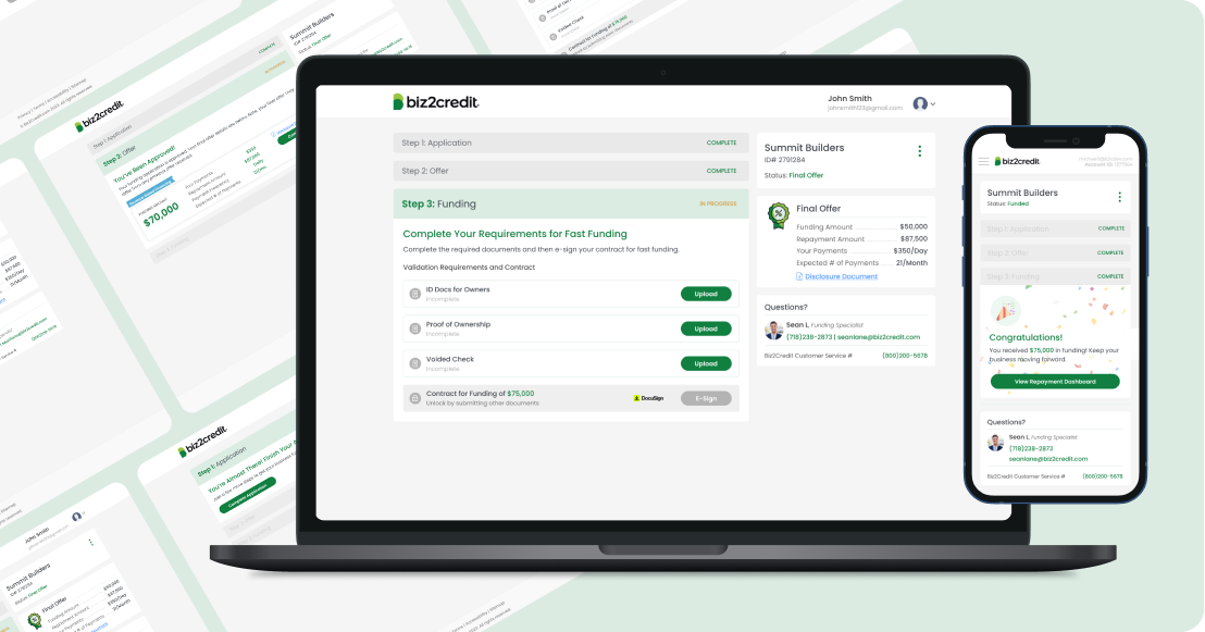
The New Dashboard
Building on the user flow map and the success of the MVP, we were ready to design the new customer dashboard. The new design incorporated several key improvements:
Clear Application Status: Tasks were now clearly labeled, and customers could easily understand what stage of the application process they were in.
Simplified Navigation: We reduced the number of pages on the dashboard, consolidating everything into a single, clean space that enhanced usability.
Task Organization: Required documents were easy to upload, with clear instructions guiding users through each step.
Outcomes:
By transforming Biz2Credit’s dashboard, we not only improved the customer experience but also enhanced internal workflows, driving greater efficiency and scalability across the platform. I am thrilled about the challenges we overcame to redesign an entire dashboard and the projected growth shows an increase of 5% in total funded customers and 3% increase in application submission.


