Customer Journey: Revamping the Customer Journey of Digital Small Business Loans
Biz2Credit
The application served as the entry point to our funnel—the first impression customers had of our service. However, poor UX was causing us to lose hundreds of potential customers. By redesigning the initial interactions, we were able to significantly improve the user experience, ultimately tripling our monthly revenue through higher conversion rates at each step of the application process.
Role Lead Product Designer
Responsibilities Product Design, Visual Design, Project Management, Content Writing, QA Testing
Problem Statement
The application suffered from long, overwhelming pages, unclear instructions, and a confusing sequence of questions. Additionally, the app, bank statement connection page, and dashboard each had separate progress bars, leading to further confusion for users. To address these issues, we streamlined the application, clarified tasks, and simplified the process, resulting in a 50% reduction in drop-off rates. Recognizing that 51% of our customers accessed the service via mobile, we also overhauled the mobile application. This update improved the user experience by addressing long forms and enhancing button functionality, making the app more intuitive and user-friendly.
Brainstorming
We began by thoroughly mapping out the entire funding application, familiarizing ourselves with the required fields on each page. During this process, we identified significant redundancy, with the application often failing to properly parse information from the lead form or repeating questions unnecessarily. To address these issues, we mapped out the entire user experience and began brainstorming solutions. After reviewing recordings of customers navigating the application, we pinpointed where they encountered friction, frustration, or abandoned the process. From there, we compiled a list of pain points and completed an initial redesign of the entire application. Here’s a preview of what that redesign looked like:
Next Steps:
The B2C application refresh aimed to minimize user friction by improving the interface, experience, and messaging. Through competitor analysis and a thorough examination of our application, I identified areas where customer confusion or impatience might lead to drop-offs, such as non-chronological question order, repetition, misleading tooltips, and pressure-inducing popups. Utilizing Microsoft Clarity for real-world customer tracking, we identified pages with high drop-off rates, one peaking at ~14%. Following an iterative redesign process, we successfully retained nearly 50% of customers within the first few months of release. But there was still room for improvement…
A Brand New Application
Following the initial redesign, we worked on removing many fields and condensing the application to take pressure off of the customer. We introduced many new components. I designed a scalable design system for the company that would be used going forward for any customer facing experience, including the new dashboard (Check out my dashboard project!). Some components we added are shown below:
New Application Design
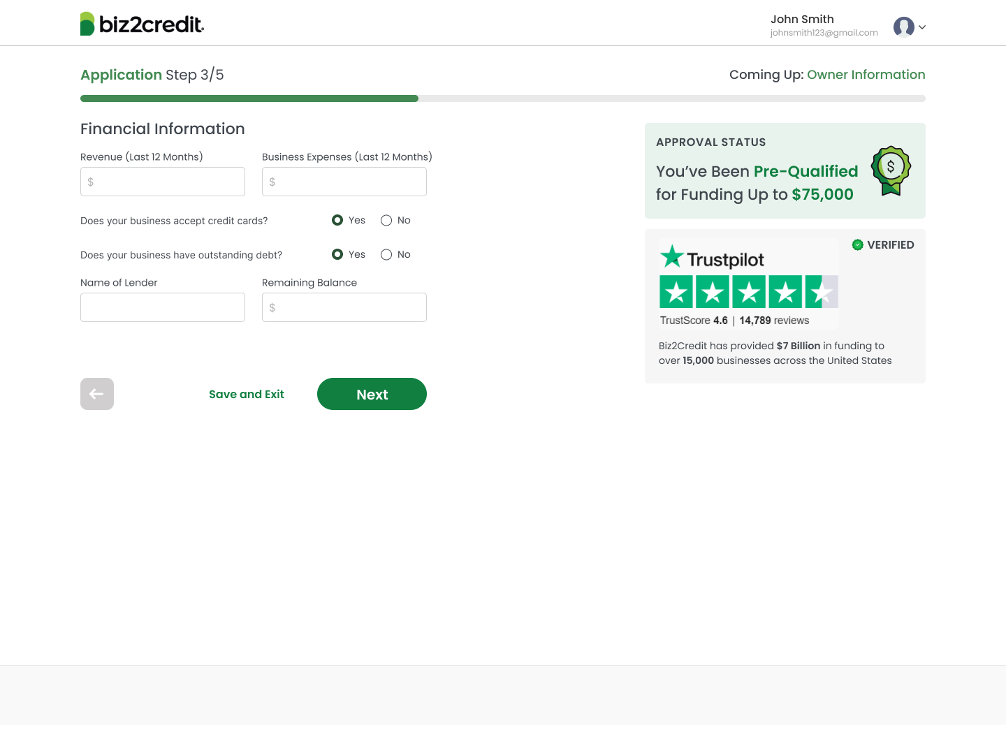
With new components and flow, I then redesigned the entire funding application for a more seamless and intuitive customer experience. Here are the designs!
Mobile Experience
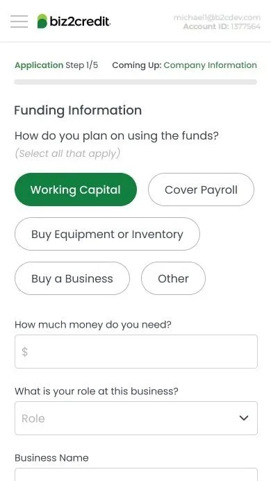
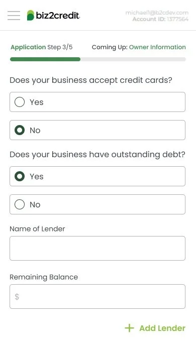
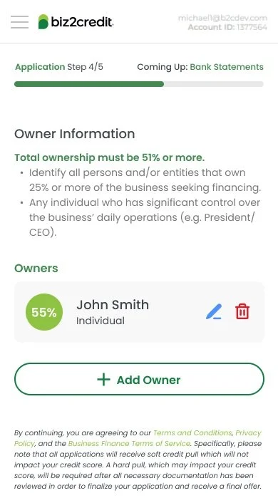
With over 50% of our customers accessing our service via mobile, it was crucial to optimize the mobile experience to boost usability and increase submissions. The existing mobile interface was hindered by long, overwhelming pages, outdated UI, and unresponsive input fields and date pickers. To address these issues, I redesigned the mobile experience by breaking down lengthy pages into more manageable content and implementing a refreshed, user-friendly interface.
The New Mobile Experience:
Lead Form and Landing Page
The applicant started their journey with a lead form, the first impression of our customer experience. The lead form currently prompted the customer to click through 2 extra pages, and our landing page hid the CTA for applying. I designed a new lead form to show the lead form right on the front page of our website. Here are the designs:
Results
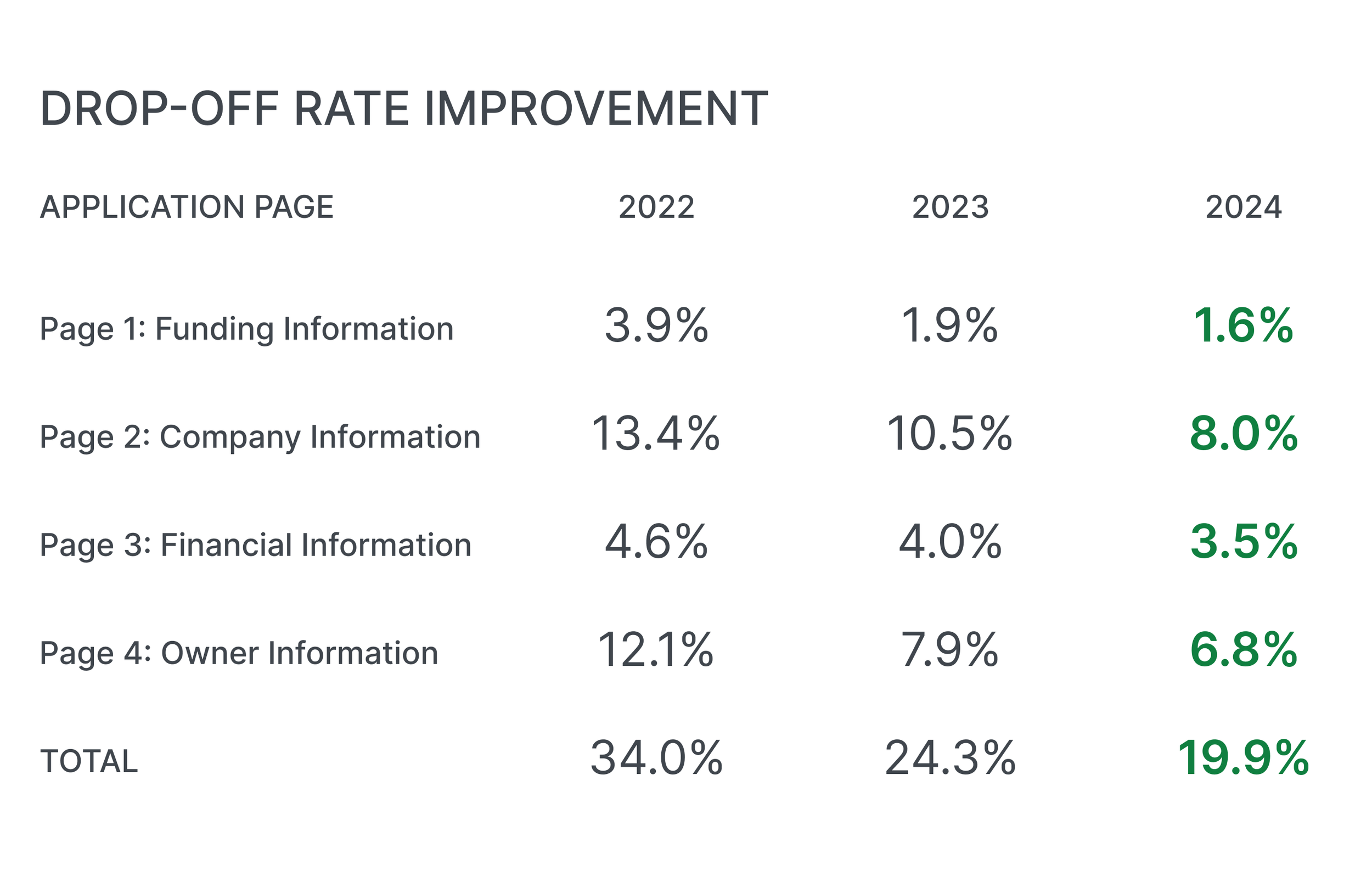
Over the course of two years, I worked continuously on refining the customer journey through numerous iterations. With each update, I successfully increased customer submission rates and significantly reduced page drop-offs. As a result, monthly funded amounts have grown from $30 million to approximately $90 million—nearly a 3x increase! Below, you'll find the improvements in drop-off rates across each page of the application.
Conclusion
Working at Biz2Credit has been an incredibly rewarding learning experience, where I've had the opportunity to collaborate with a talented team and see the direct impact of my contributions. The customer journey project was particularly meaningful, as it highlighted how thoughtful product design can drive significant business results. Improving customer retention by nearly 50% was a major achievement, underscoring the power of great design in transforming business outcomes.


